
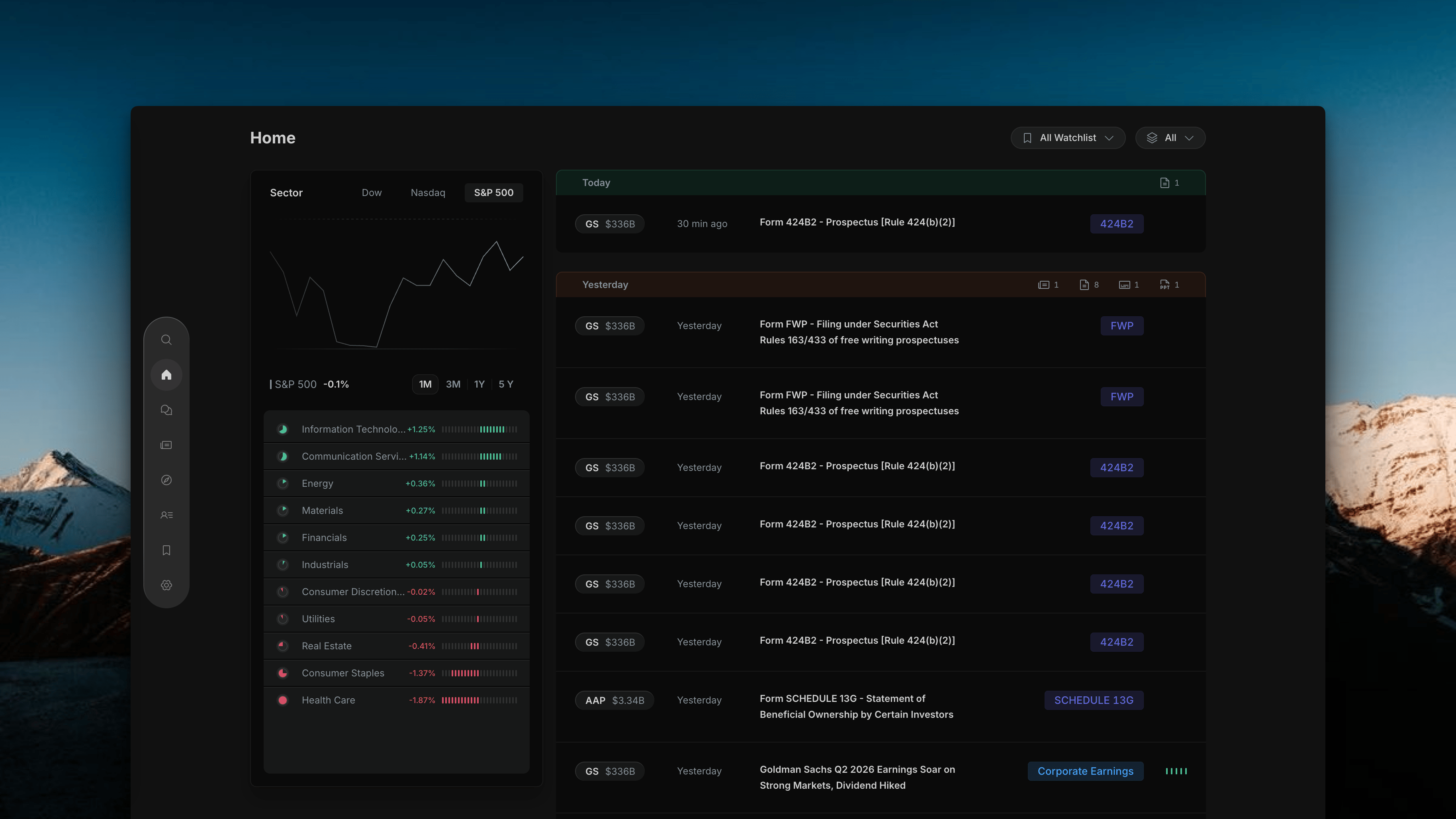
Insighthread Home page default view — left market context panel and right activity feed
Page Layout
The page is split into two panels side by side:Left Panel — Market Context
Index performance chart with a sector breakdown list. Gives you broader market context alongside your watchlist activity.
Right Panel — Activity Feed
A live stream of news and filings for your watchlisted stocks, grouped by date. Each row shows the ticker, market cap, time, headline, and a type badge.
Left Panel
The left panel has two parts stacked vertically.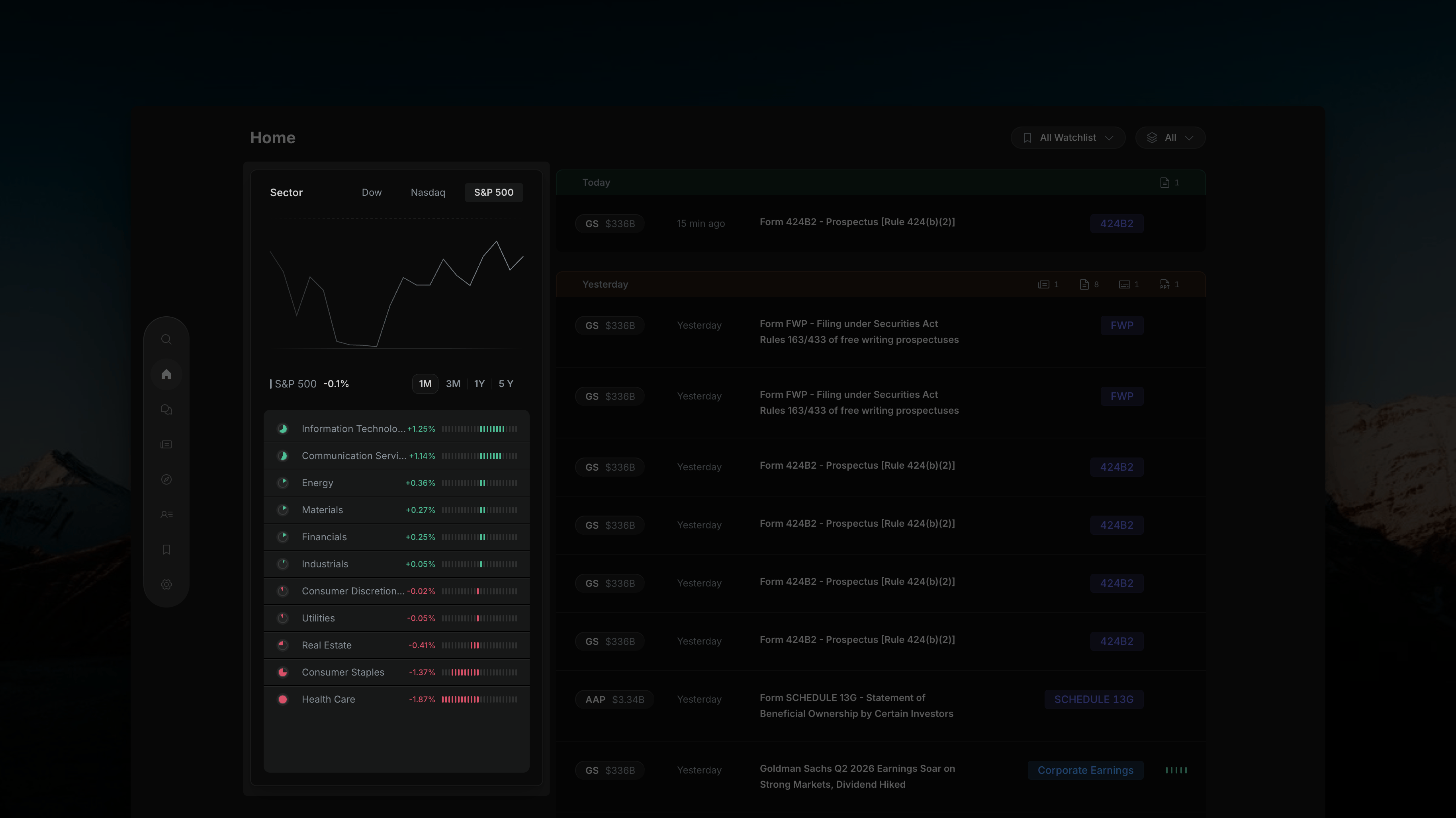
Insighthread's left panel — S&P 500 index chart with sector performance list sorted best to worst
Index Chart (Top)
At the top of the panel, three tabs let you choose which index to plot — Dow, Nasdaq, or S&P 500. The selected index is highlighted (e.g. S&P 500) and its current return is shown below the chart (e.g. “S&P 500 −0.1%”). Use the timeframe buttons to change the chart window:Sector Performance List (Bottom)
Below the chart, all 11 GICS sectors are listed with their percentage change for the selected timeframe. Each row has:- A colored dot on the left (green = positive, red = negative)
- The sector name
- The % change
- A horizontal bar scaled to the magnitude of the move
The sector list recalculates whenever you change the timeframe — switching from 1M to 1Y updates all sector returns for that window.
Right Panel — Activity Feed
The feed shows a live stream of events for your watchlisted stocks, grouped by date.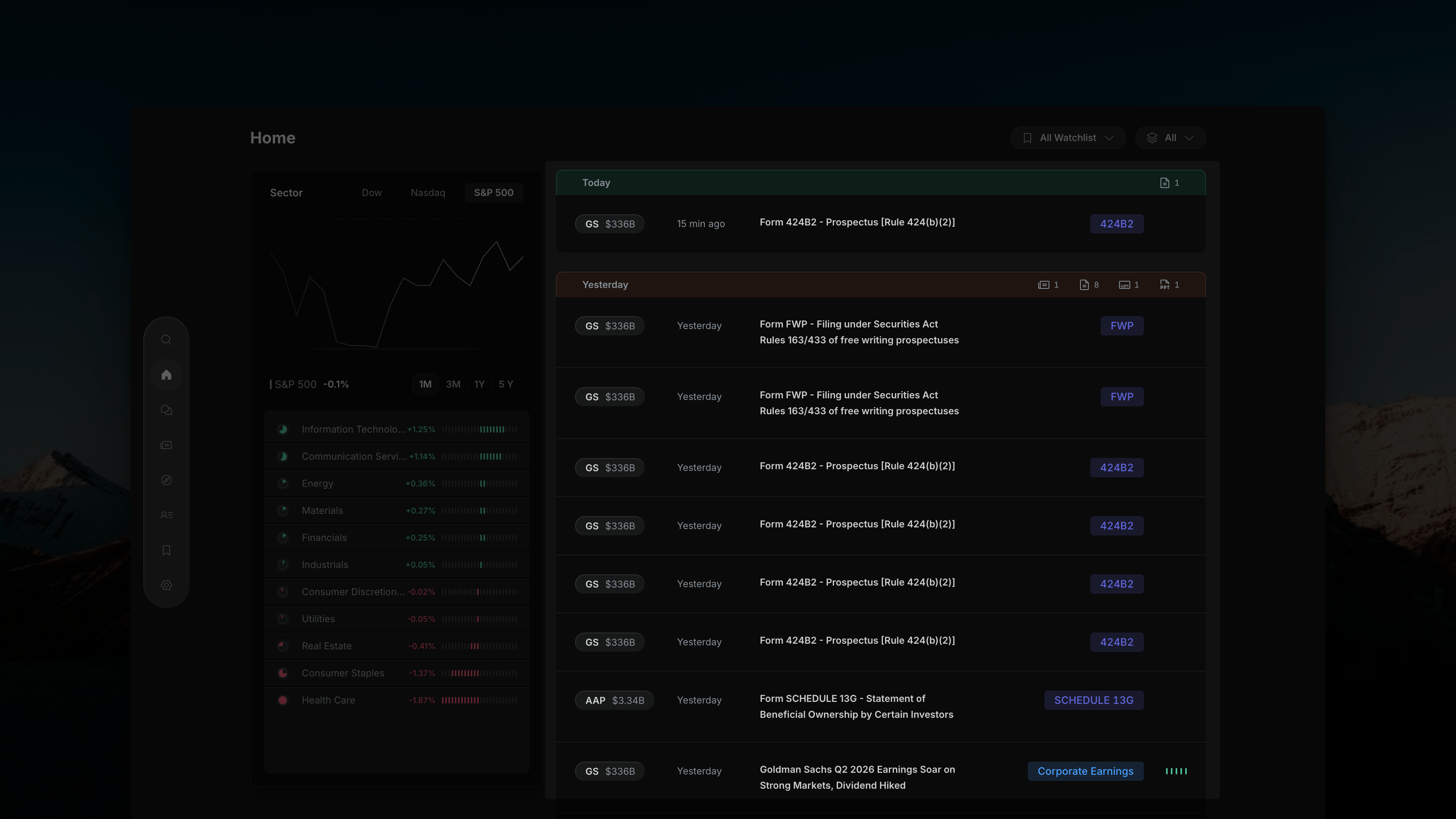
Insighthread's right panel — activity feed grouped by date, showing filing rows and news rows for watchlisted stocks
Date Group Headers
Each group (e.g. Today, Yesterday) has a header bar with small icon badges on the right showing a count for each content type available in that time window:
These counts are always visible regardless of which type filter is active — so you can see what’s available in any time window at a glance.
Each Row
Every row in the feed contains:Row Types in the Feed
The feed contains two distinct types of rows, often appearing together for the same company event:Filing Row
Shows the raw SEC document — form name and items (e.g. “Form 8-K − Current report − Item 2.02 Item 9.01”). Badge shows the form type (e.g.
8-K, 424B2, FWP, SCHEDULE 13G). No impact bars.News Row
A plain-English summary auto-generated from the filing (e.g. “Goldman Sachs Q2 2026 Earnings Soar on Strong Markets, Dividend Hiked”). Badge shows the event category (e.g.
Corporate Earnings). Includes a 5-bar impact signal.Top Controls
Two controls in the top-right corner scope the entire feed. These are covered in detail in the next sections:- All Watchlist — filter the feed to specific watchlists
- All — filter by content type (News, SEC Filings, Transcript, Presentations)